Word Bookstore
Creating an easily navigable, brand representative website
The Client
Word Bookstore
Timeline
4 weeks
User Research Design + Branding UI Design Prototyping Testing
My Role
Mid-fidelity website prototype, desktop view
Scope
Word is an independent leaning bookstore committed to being a welcoming, friendly, and inclusive space for all people. Everything in the store has been thoughtfully selected, featuring a variety of voices and stories. Additionally, Word offers many free and affordable events ranging from readings to craft workshops. Word Bookstore is the neighborhood bookstore every book lover wishes they had - a place to pop into on the way home from work to check out the new arrivals, or a place to spend an hour or two perusing the shelves and getting recommendations from the literary-passionate employees.
About the store
Project Context
At first glance, it’s clear that the Word Bookstore website could use an upgrade, but I needed to determine exactly where to focus my efforts. To begin the process, I ran some usability testing on the website in its current state to get a feel for what works and what doesn’t for the average user.
Task to complete:
Purchase a mystery book
What was revealed:
This simple task was not easy for users, with only one of three succeeding in getting to the checkout.
Usability testing takeaways:
The Word Bookstore website is more focused on in-store events and community happenings rather than making online purchases
It’s hard to peruse the site to find a book to buy; better if the user knows exactly the book title/author they’re looking for
Staff recommendations seem very important to the shop - slightly easier to find a book that way
There are a few categories in a ‘book lists’ tab to help a user narrow their search - but the category names are confusing
Homepage is cluttered, not much organization, slowed users down
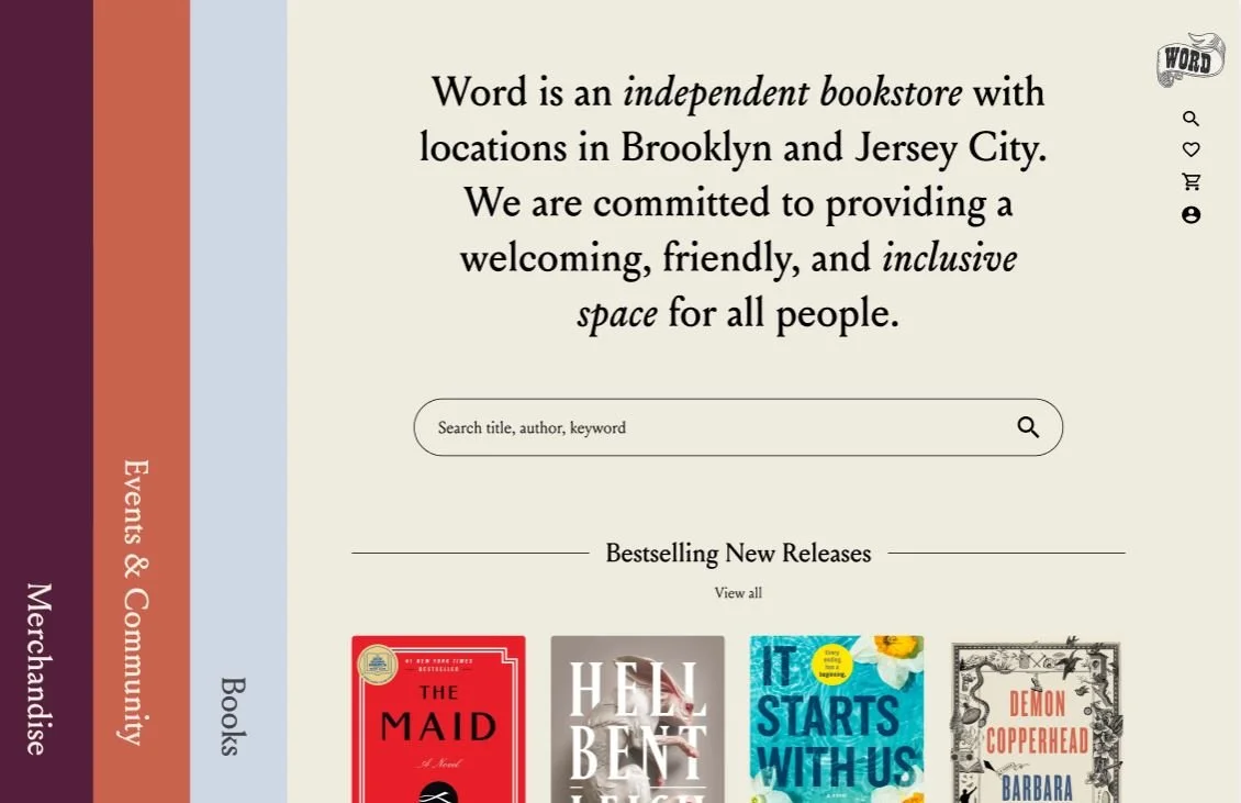
The current homepage of the Word Bookstore website.
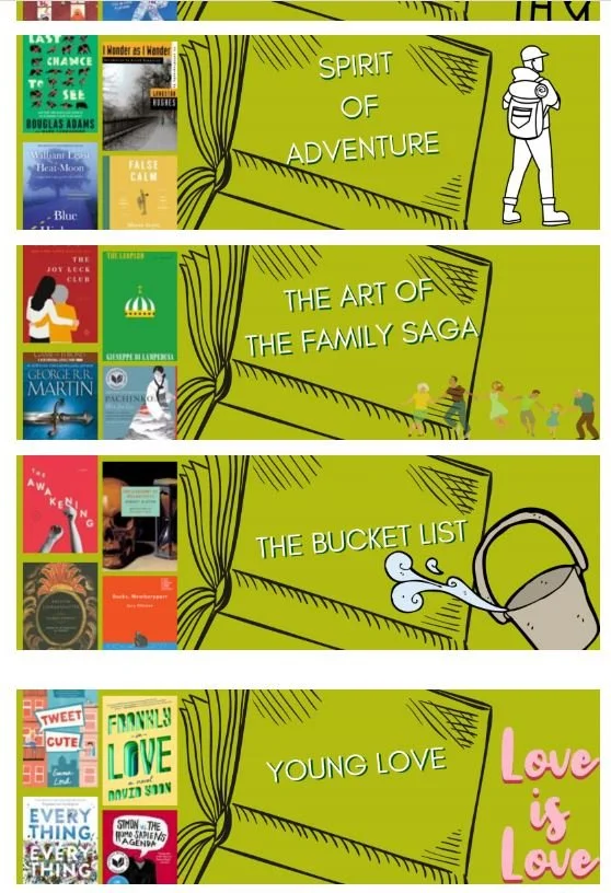
Example of how books are currently categorized on the website.
Exploring the issue at hand
The problem
Independent bookstore supporters want to be able to utilize the Word website so that they can search for what they like, discover new interests, complete purchases smoothly, and view upcoming events.
The solution
Word Bookstore will have a multifunctional online platform, enabling its community to support the store from anywhere. Improved website organization and clear item categories will make purchasing easier and keep the community updated on Word's activities.
Research
Understanding our users
In order for Word Bookstore to succeed online, my first step was to develop a deeper understanding of the potential user. The research phase of the project consisted of user interviews, C&C analysis, and a card sorting exercise to help me see how people think books should be categorized.
1 Market research takeaways
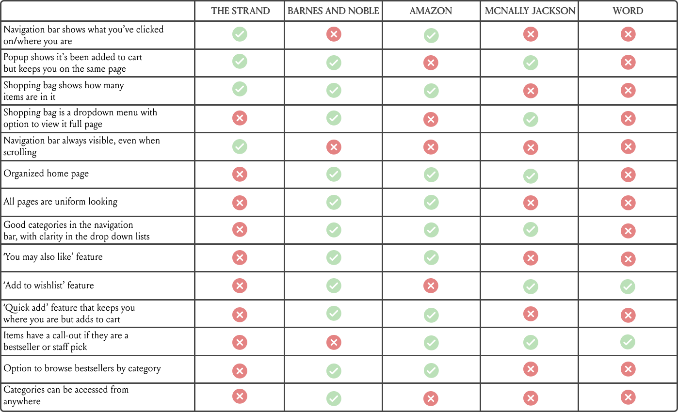
First, I conducted comparative + competitive analysis of other companies that offer similar services - both independent bookstores and chains.
Shops researched: The Strand, Barnes and Noble, Amazon, McNally Jackson, Word Bookstore
Exploring these bookstore websites gave me a lot of insight into things the Word website was lacking, like simple navigation, shopping bag clarity, features like wishlists and suggestions, and book categorization.
2 Card sort takeaways
Since the current website categorization method proved difficult for users to navigate in my initial usability testing, I decided to see for myself how people might categorize books on their own. For 40 items, I conducted an open card sort. I asked participants to sort a variety of books into categories of their naming.
The most commonly named categories were: classics, horror/thriller, self help, essays/memoirs, children, race in America, social justice, young adult, romance.
In retrospect, the card sort could have been more helpful if I had instead set it up with all the contents of the site, not just books. I could have used some input on how people might categorize everything instead of basing it off the C&C research. Next time!
Now, meet two Word website users
The final personas highlight the different user wants and needs that were revealed from the research.
Rita, the bibliophile
Rita is a big supporter of independent bookstores, and Word used to be her neighborhood shop. Since she moved out of the neighborhood and can no longer go to the store in person, she wants to continue her support from afar, but the difficult-to-navigate Word website makes that nearly impossible.
Sean, the aspiring reader
Sean isn’t much of a reader, but wants to change that. He just moved to the neighborhood and loves the idea of having a local bookstore where he can meet new people. He noticed that they advertise a lot of social events - book clubs, live readings, etc. - which interests him, but he needs help knowing where to start. Going to the shop is great, but he wants the option to check out and sign up for events on the website.
This brought me to the design phase.
Site Map
The top priority was to give this website a better structure - simple, straightforward, less cluttered. The homepage offered far too many things to choose from, and based on the user research (how it slowed people down in trying to find what they were looking for) and the C&C analysis (how other sites organized their homepages,) I began with building a site map.
I decided on three main categories - Events + Community, Books, and Merchandise.
Next, I made some rough sketches to help me visualize the site, created user flows for the personas, and finally created wireflows to illustrate how those people would be moving through the website.
Wireflows
Wireflow for Rita
Rita just wants to find a new book to order.
Wireflow for Sean
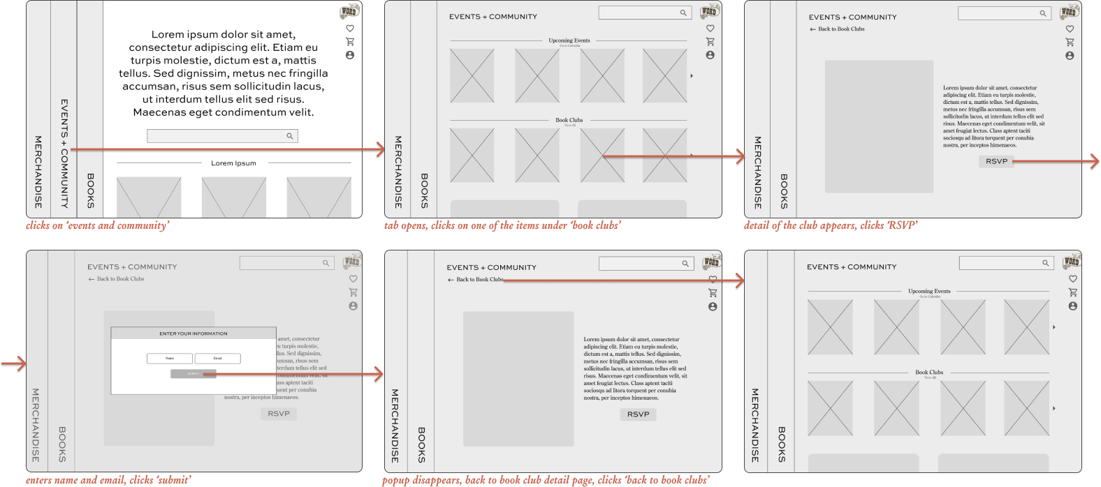
Sean wants to browse events and sign up for a book club.
The prototype
The final designs
After finalizing the wireframe structure and settling on the branding, the next step was to bring my vision to life. I wanted to ensure the site felt fun and welcoming, since that’s the vibe of the store (I’ve been myself, many times.)
Landing page
I chose to showcase the Word Bookstore message first, since it’s a big part of their DNA. Next, a search bar since this is generally where users will go first. After that, Bestselling New Releases - based on the market research I did, this was the most frequently highlighted category.
The main categories on the left side are meant to evoke the feeling of a bookshelf, and when the user scrolls down, the categories will move with them.
Landing Page cont.
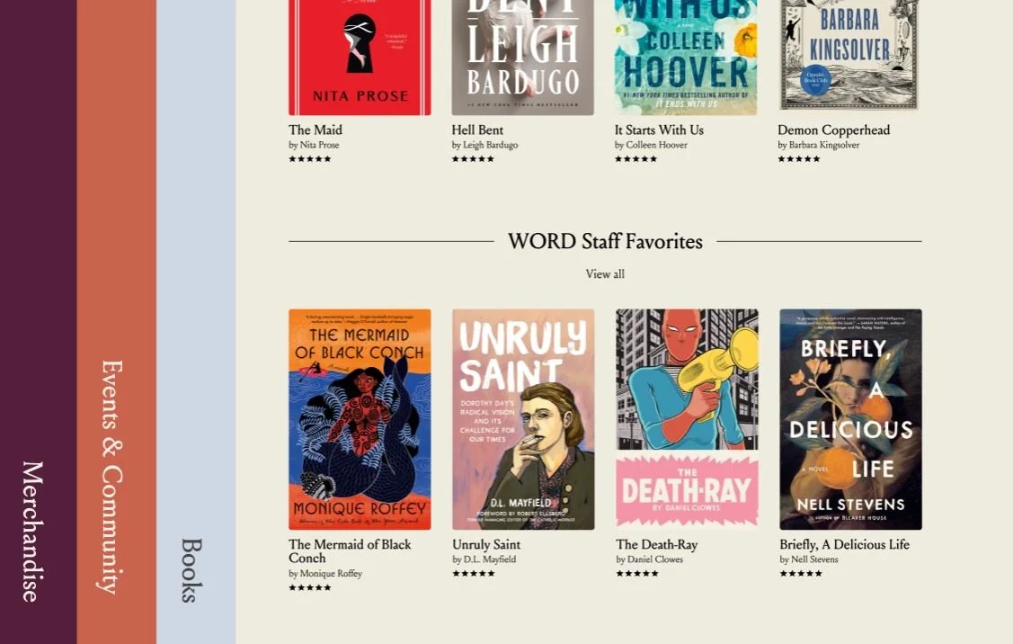
Scrolling down on the homepage will reveal WORD bookstore staff picks (another big part of their DNA - at the physical store, there is a huge display of books with handwritten notes about them by the employees. It is also showcased on their current site, just not as prominently.)
Scrolling down more…
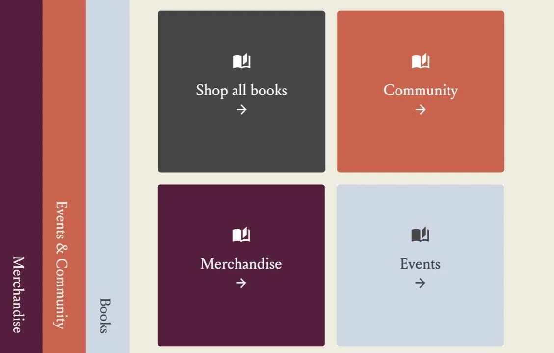
The categories on the left hand side are displayed again, to remind users what they can find on the site.
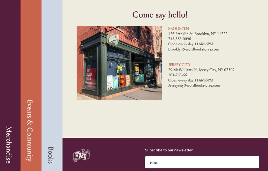
At the bottom of the page, there is info about the physical stores, and an option to sign up for emails.
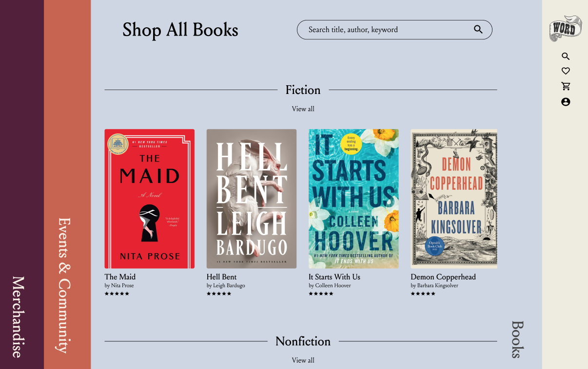
Books tab
Scrolling down will reveal more book categories (of which the card sort helped me determine.)
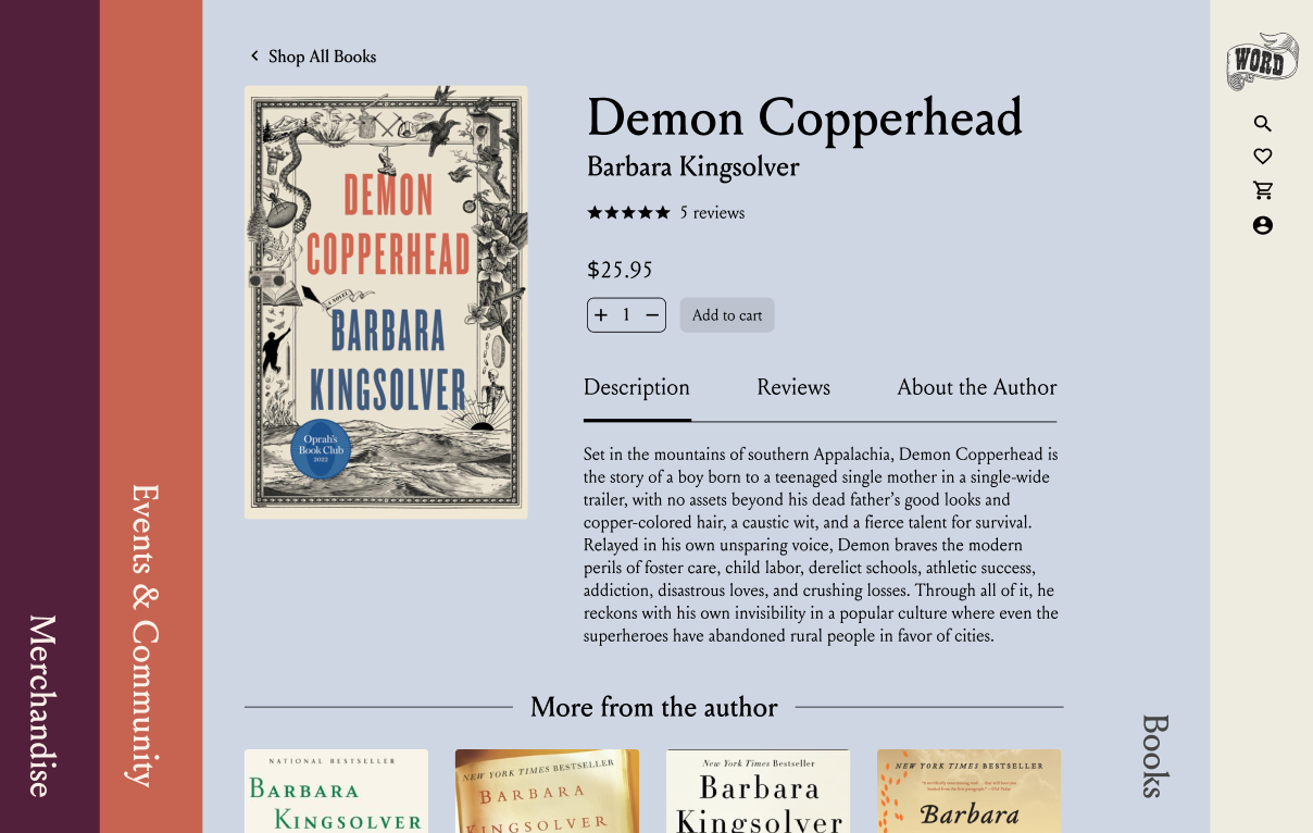
Book detail page
Events & Community tab
Rita’s flow - making a purchase
Sean’s flow - joining a book club
Main goals of the redesign:
Provide the user with a streamlined experience, whether they know exactly what they want or are just perusing the site to see what’s going on in the community.
Keep with the spirit of the store - welcoming, friendly, quirky.
A brief note on the usability testing
Feedback
- Add ‘quick-add’ options on product pages, allowing a user to quickly add a product to their cart
- Different colored buttons in some places was confusing
- User should be able to view more about a book without having to click on it (perhaps hovering over and item will reveal more info about it)
- Calendar feature is necessary - would be good to be able to see a whole calendar view and days where events are happening- There should be more info under the book clubs - about the hosts, who is attending, the current book, previous books read, etc
- Need a better way to access all the book categories. One idea is to have all the categories on ‘view all books’ page with a drop down menu at the top
- On Homepage, add an option below carousels to ‘View more Categories’ or ‘See More’
